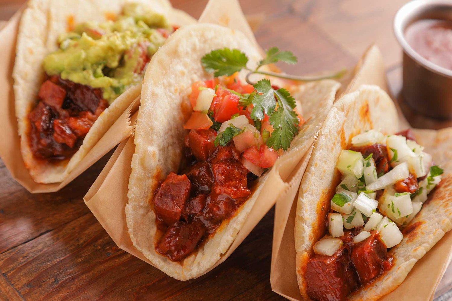
With more and more restaurants going to an all digital format there are a few things you can do to photograph your menu items and make them look as delicious as they actually are! After all, we all take the first bite with our eyes, right? So, let’s just get right to it.
Lighting matters:
Take a look at the light in your shop. More than likely the lights in the back of house are not perfect for delicious looking photography. But you’ve probably got a big window, simply by placing the plate into better light will help.
Colors matter:
When you’re selling online, if it’s food, underwear, or really anything else, colors matter. People will be drawn to a “pop” of color. So shoot your most colorful dishes first, you’ll probably get more traction by putting them up online.
Angle matters:
Get low, get high. Just change your angle a bit to get something a little unexpected. The key take away here is to stop someone in their scrolling so they click your link, right? So, give them something to stop on.
Background matters:
Really simple take away, simple backgrounds will make your food pop more. We’re dealing with a huge amount of consumers on phones these days. SO, keep the background simple, we all love a well dressed room, but you’re selling that to-go hot chicken, not your environment. White, gray, black, a table top, they all work. Try if you can to stick to solids to keep the focus on your food.
Remember we all take our first bite with our eyes so go make us hungry!